The city of Georgetown is undergoing a transition. Its entire legacy stretches back nearly 2 centuries. Hence it becomes important that through this transitional phase, one does not lose sight of what made the place what it is today.
The city is defined by its natural beauty, farms, forest trails and its local entities. The ultimate goal is to make the present & future generations aware of these gems!
Hence, this presents an ideal opportunity to use the power of graphic design to define the identity, respect & celebrate its beautiful legacy, while looking forward to a bright future ahead!
The final logo chosen was derived from the simple lower-case serif ‘g’. The curved strokes are in line with the natural terrain of Georgetown, where most of the sights are driven by the streams and grass patches. The logo represents a sense of smoothness & elegance, of being natural, just like most of what Georgetown is today. It also presents an interesting transition between old type (serif font) and modern minimalism.
The project involved the research and led to the design of identities for major entities in the city like the Hungry Hollow and Limehouse forest trail. Georgetown farmers market.
The design of the signages was kept minimal and contextually relevant. The design of the Limehouse logo is inspired by the multiple terrains
of the trail. It consists of multiple connecting bridges which are represented by the intersection between the alphabets.
The logo of Hungry hollow is kept simple, as an intersection of the initials ‘H’ and ‘H’.The idea is to represent how it meanders within the precinct, as a seamless blend between nature and man. The overlapping of the line also signifies the multiple paths and discoveries that it offers.
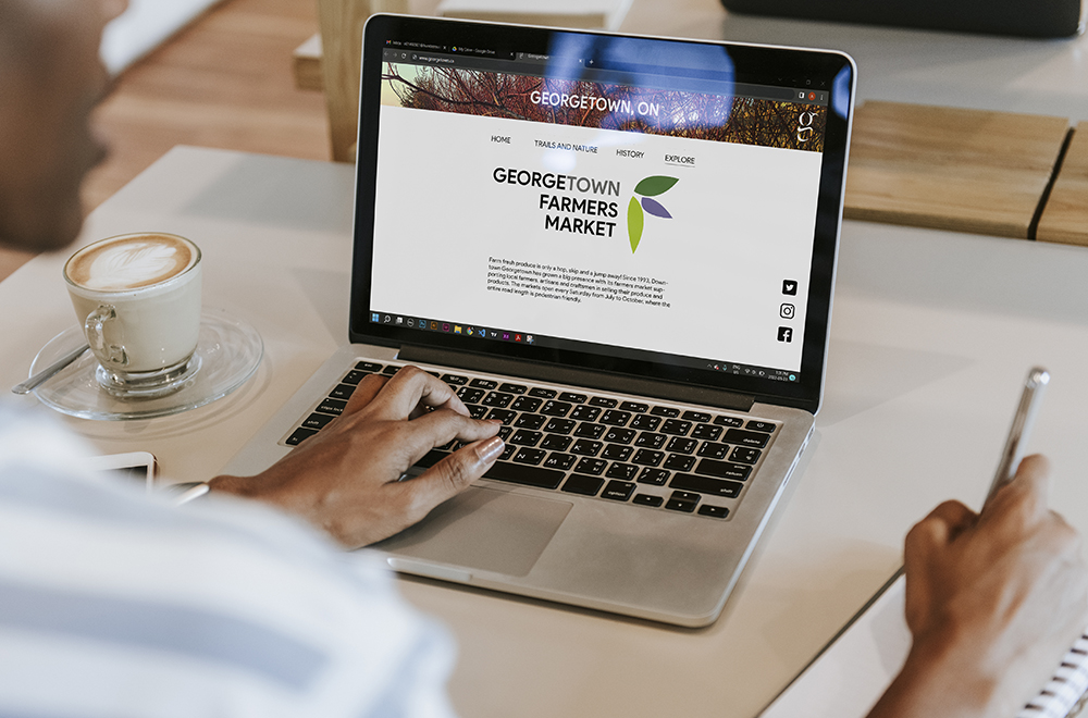
The farmers market was designed by abstracting the alphabet F into 3 distinct leaf forms, allowing flexibility of usage and application.
Along with the identity, merchandise was designed as a means of spreading the brand among locals and others. The website layout was revamped with the branding to serve as a source of information and attraction to the new-comers and residents.