Chancery Neue is inspired by cues from the past. The visual beauty of calligraphy, specifically that of chancery cursive is the underlying consideration in the design. Added to it, the minimal type seen on public transport in the city of Bombay made me want to adopt a similar characteristic into a modern language. The overall architecture is intended to be kept minimal, very much like the modern typefaces of Raleway or Proxima. The blend of these elements results in a typeface which negates the notion of time- having the elegance of the past, minimalism of the present and timelessness to sustain itself and live through the future.
The construction of the typeface is elegant and subtle at the first glance, giving it a notion of being transitional. Its visual appeal makes it seem humanist in nature due to the variations in stroke weight and a calligraphic feel. However an attempt has been made to target legibility and hints towards being geometric. Overall, it has the features of a transitional and geometric typeface, yet bearing a humanist touch.
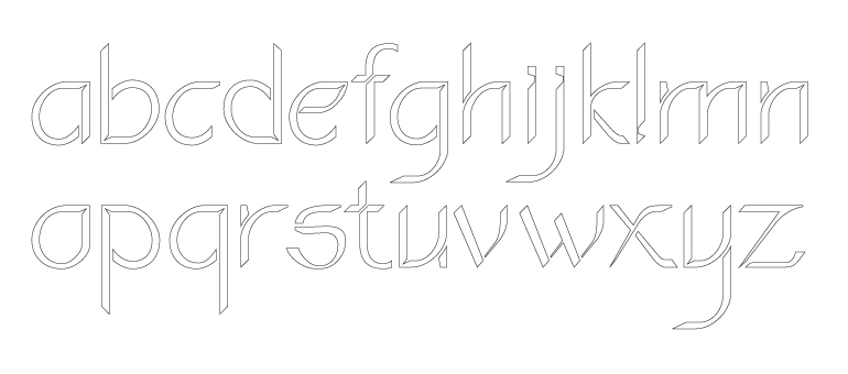
Chancery Neue has a tall x-height making it legible in all sizes. Each letter has a notable and unique counter. The idea is to open out new & subtle apertures in each letter to generate a sense of intrigue and surprise. The curves and stroke contrast are not extreme, thus aiding the reader. The small gaps created in each letter become more pronounced as the font-size is increased, making it stand out. The special aspect about the typeface is that at different sizes, one notices different elements, which further attributes to the attempt at creating these nuances and features.
The use of Chancery Neue is multipurpose. Its curves and angles allow it to stand out as titles or headlines. It can act as an effective decorative typeface. However, its usage can effectively extend to body copy text, primarily intended to make text stand out, it can be a great fit into posters or invite cards, considering its visual nature of combining curves and linear strokes. Although it does not contain any serifs, its overall aesthetic lets it contrast effectively with sans-serif fonts.